

Web marketing and communication services.
Active clients throughout Italy and abroad.
ROCCHI TRANSPORTS ROCCHI TRANSPORTS
objectives:
Goals
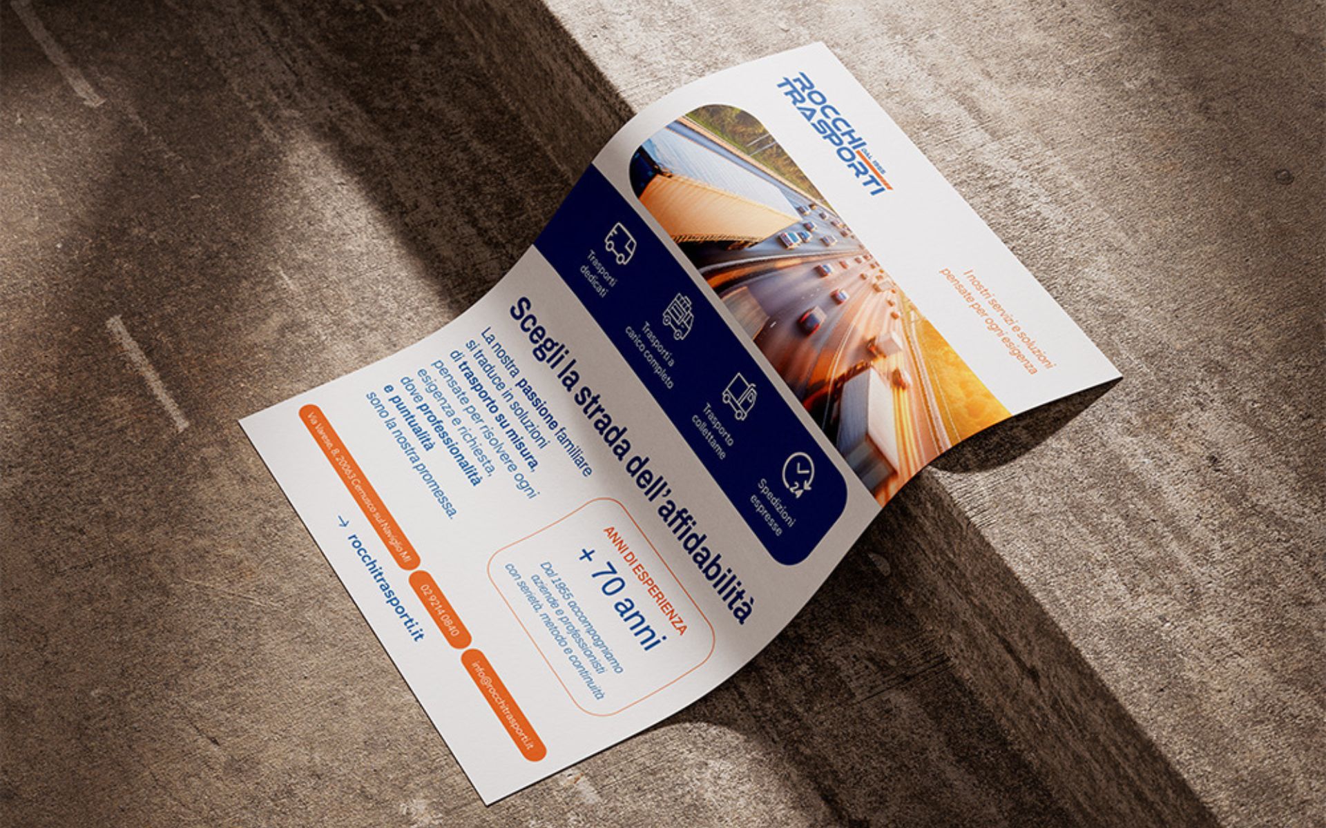
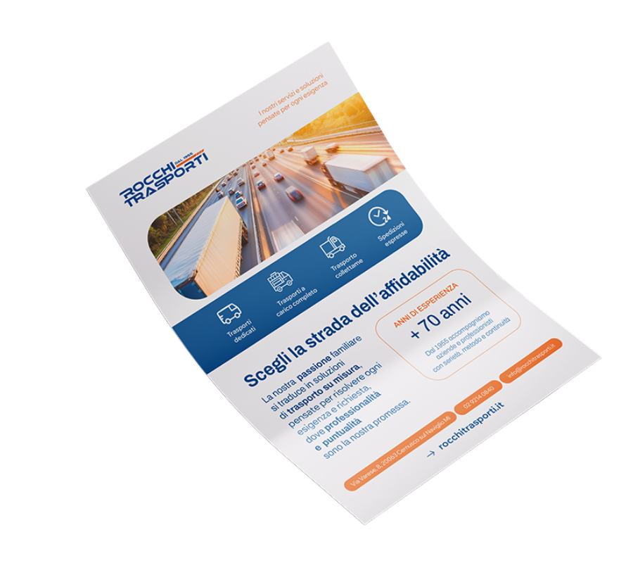
To enhance and promote Rocchi Trasporti’s services, we have produced a dedicated flyer. Rocchi Trasporti is a company specializing in fast and safe freight solutions throughout northern Italy with services such as: groupage transportation, full loads, dedicated transportation and express shipping.
The purpose of the project was to comprehensively present the company and its activities, specifically:
The design of the flyer was guided by an ongoing discussion between our team and the client, so as to best meet their needs.
The creative process was developed around a few key steps:


The highlights of the completed project can be summarized in 4 points:
The choice color and typography of the flyer reflects the style of the website and the respective logo.
Overall, it is presented with vibrant colors and a layout particularly dynamic and youthful.
We edited the copy, developing content consistent with the tone of voice of the brand.
The message was built around the story of the business, telling its experience and quality in clear, incisive and engaging words.
The data entered tell the corporate history and the full range of services, organized strategically to ensure an simple and accessible reading for all.
In addition, to facilitate orientation within the flyer, the following have been used specific icons for each type of service, making each information more immediate and easy to find.
The type of photo chosen is designed to capture and engage the attention of the reader, giving the whole a character that is fresh and appealing.
Entrust your projects
to the team at Isola
Discover more
graphic design projects
It is our case histories that speak for us! They show our projects, our approach, and most importantly, our results!
Web marketing and communication services.
Active clients throughout Italy and abroad.
ALWAYS OPEN DURING THE HOLIDAYS!
Design & Copyright by Isola di Comunicazione sas | All Rights reserved 2012-2025 | VAT 12025180964
What's New: Google Premier Partners 2025 Awarded!
We fall within the top 3% of the best performing agencies in Italy 🚀

