

Web marketing and communication services.
Active clients throughout Italy and abroad.
BLEES BLEES BLEES BLEES BLEES BLEES BLEES BLEES
project:
Goals
For Blees, an innovative startup in theorthodontics sector, we developed the company logo. Blees offers a teeth-straightening treatment using clear, comfortable, and removable aligners. The company’s focus is not only onthe aesthetics of the smile, but above all on oral care and health, with the goal of offering a positive and personalized experience to every patient.
The request for this project was as follows:
In the brand design project for Blees, the goal was to convey professionalism and innovation without sacrificing an empathetic and approachable tone. A brand designed to inspire trust and peace of mind, with a strong tech component but always centered on personal well-being.
We worked to combine the concept of oral health with a light, fresh, and harmonious communication style capable of appealing to a young and dynamic audience that values aesthetics as much as the quality of orthodontic treatment.


The project development process consisted of the following operational steps:
Discussions with the client clearly brought to light the core of the project: not to focus solely on the aesthetics of the smile, but to strongly convey the value of health and the quality of orthodontic treatment.
We then analyzed the orthodontics sector and the market for clear aligners to position Blees as an innovative brand that is committed to the patient’s true well-being.
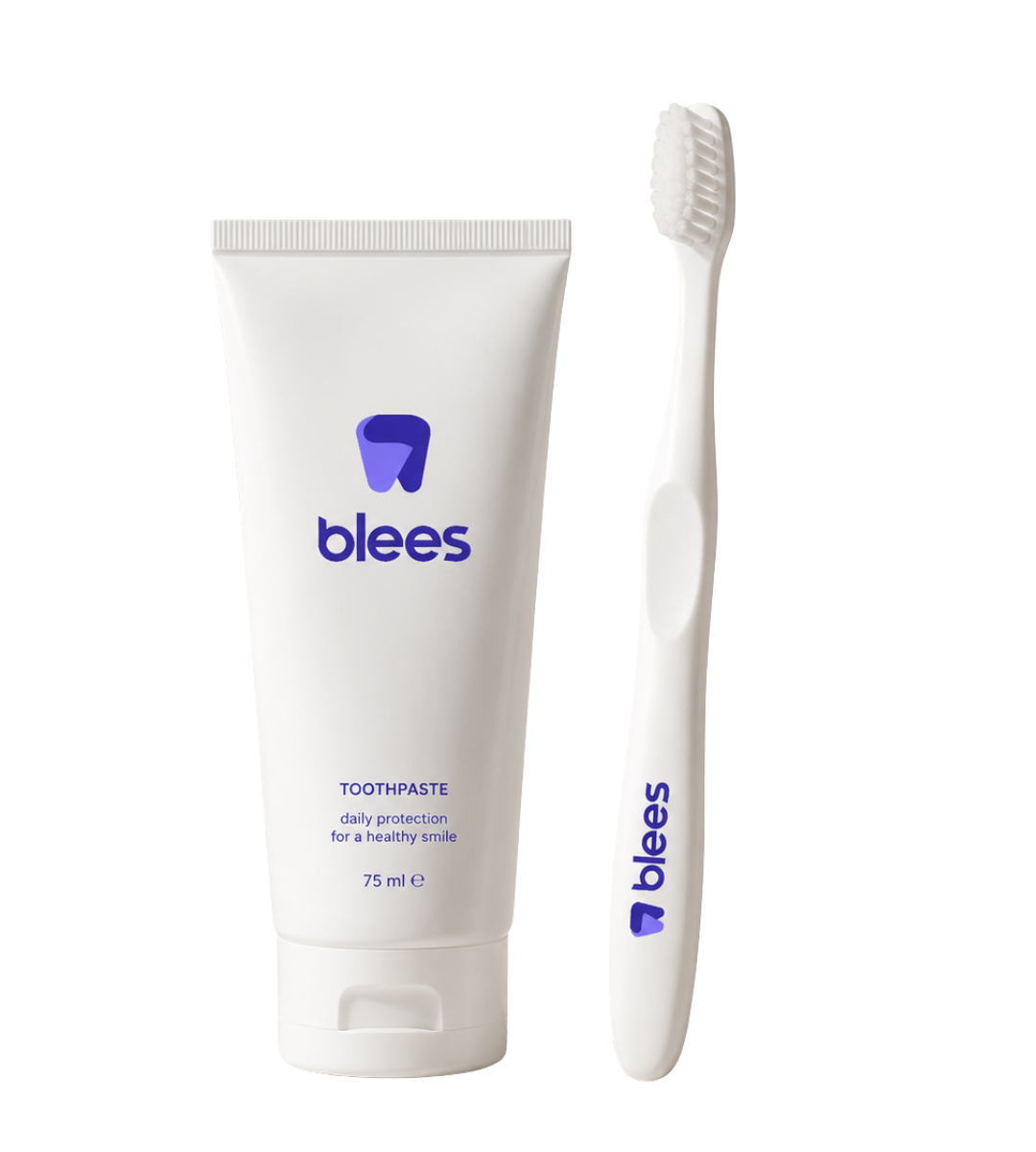
The logo design is inspired by the shape of a stylized tooth, reinterpreted in a symbolic way: the two ends of the tooth appear to embrace each other, representing care, protection, and human connection.
The chosen typeface is Comodo, a modern, clear, and clean sans-serif font that reinforces the brand’s tech-forward and youthful character.
We developed mock-ups to test the effectiveness of the visual identity in real-world contexts: packaging, digital media, print media, and medical and promotional materials.
Finally, we created the brand book, an essential tool for ensuring consistency and brand recognition in every application of the brand.
Entrust your projects
to the team at Isola
Discover more
graphic design projects
It is our case histories that speak for us! They show our projects, our approach, and most importantly, our results!
Web marketing and communication services.
Active clients throughout Italy and abroad.
ALWAYS OPEN DURING THE HOLIDAYS!
Design & Copyright by Isola di Comunicazione sas | All Rights reserved 2012-2025 | VAT 12025180964
What's New: Google Premier Partners 2025 Awarded!
We fall within the top 3% of the best performing agencies in Italy 🚀

