G.S. TREE SERVICE G.S. TREE SERVICE G.S. TREE SERVICE
project:
Goals
For GS Tree Service, a company specializing in green maintenance, we were in charge of developing the company logo. A business that offers professional services such as tree climbing pruning, controlled felling of tall trees, planting, milling and phytosanitary treatments.
The request for this project consisted of:
The goal was to define a new, fresh, and recognizable brand aesthetic that could express the strengths of the business.
The work therefore focused on creating a design with an understated yet impactful appearance that could convey focus, reliability, and elegance.
The implementation process focused mainly on 3 distinct phases:
The discussion with the client was crucial to highlight the heart of the project: to go beyond the common concept of a tree to effectively communicate the value of the company's services.
Next, we analyzed the sectors and market concerning arboriculture and tree pruning to position GS Tree Service as an experienced and qualified name.
In the 2nd phase of the project, we dealt with the idea. We studied a morphological style inspired by typical natural elements. Translated to a minimum and in a geometric key, to build a clean and essential pictogram.
In the final stage we were responsible for designing the actual pictogram: a simple symbol to be used as a repeatable element in a circular shape.

Here are the main features of the realized project:
Thefinal aesthetics of the logo are inspired by the shape of a stylized tree, consisting of a simple repeated module, recalling the leaves of a canopy. The balance is interrupted by one of these elements, resembling a fallen or damaged piece, recalling the protection of the land.
Overall, ayoung, dynamic and competentcompany working to protect and enhance green areas is told with a distinctive touch.
The color palette consists of two main hues, carefully selected to refer clearly and intuitively to the typical colors of nature.
The typography adopted is the typeface Manrope, a sans-serif chosen for its readability and versatility.
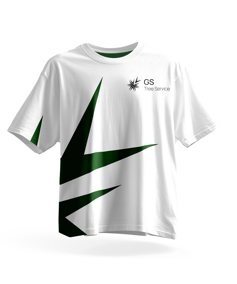
We made realistic mockups, to showcase the adaptation of the visual identity in multiple contexts, such as: uniforms, gadgets, and corporate products.
Finally, we concluded with the relevant brand book: a fundamental document to define, in detail, the distinctive features of the brand.
Entrust your projects
to the team at Isola
Discover more
graphic design projects
It is our case histories that speak for us! They show our projects, our approach, and most importantly, our results!

Web marketing and communication services.
Active clients throughout Italy and abroad.
ALWAYS OPEN DURING THE HOLIDAYS!
Design & Copyright by Isola di Comunicazione sas | All Rights reserved 2012-2025 | VAT 12025180964
What's New: Google Premier Partners 2025 Awarded!
We fall within the top 3% of the best performing agencies in Italy 🚀


