

Web marketing and communication services.
Active clients throughout Italy and abroad.
SL EUROPE SL EUROPE SL EUROPE SL EUROPE SL EUROPE
project:
Goals
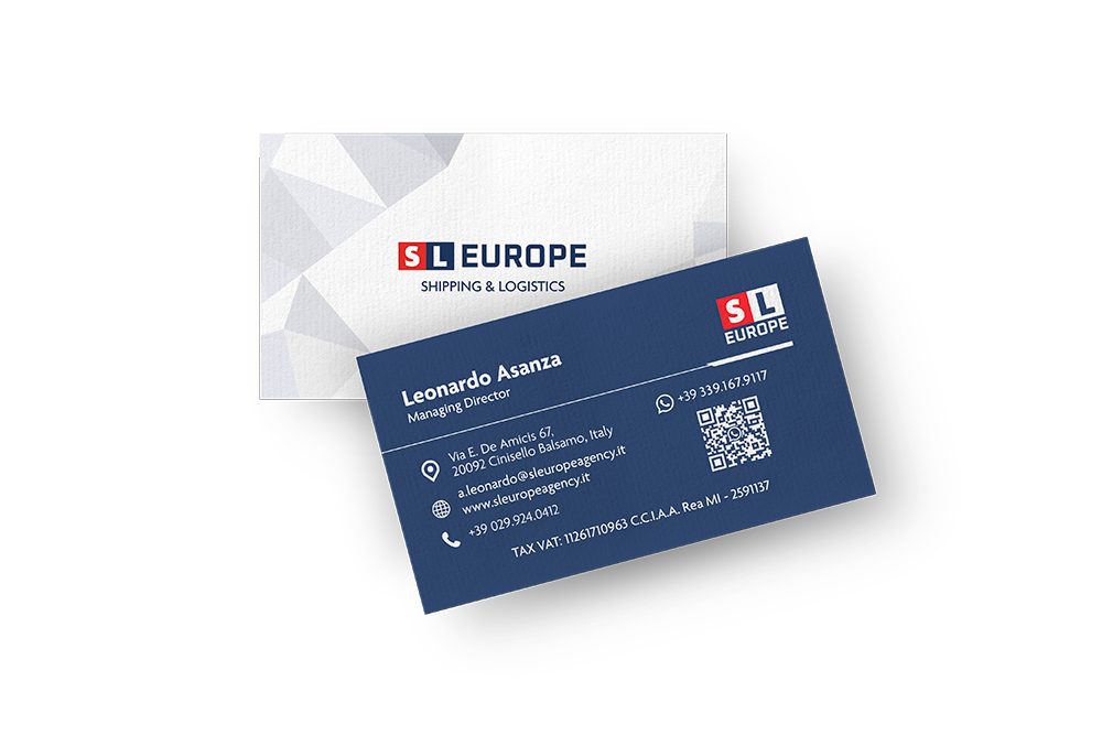
After creating the new corporate logo for SL Europe, we oversaw the creation of the business card. SL Europe is a company specializing in freight transportation and customized logistics services, with an established track record in international shipping.
For this project, we studied a unique and eye-catching design capable of communicating the energy, expertise and international vocation of the business.
We mainly focused on the following aspects:

The final design includes:
The composition is clean and elegant, enhanced by innovative and fresh graphics.
The color contrast between the front and back combined with the inserted graphic elements gives an overall dynamic and harmonious appearance.
Within the ticket, data are organized from top to bottom in a clear and concise hierarchy.
Each piece of information is carefully placed and accompanied by a corresponding icon to guide and facilitate reading.
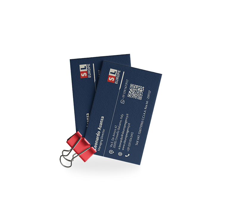
We also followed the printing stage, selecting high-quality materials.
The thick, durable grammage gives the card seriousness and reliability, while the choice of embossed details and elegant finishes further enhance its value and quality.
Discover our complete Graphic Design service: brand identity and logo, printed communication,video marketing, web design, infographics and corporate presentations, gadgets and graphics for online advertising.
Entrust your projects
to the team at Isola
Discover more
graphic design projects
It is our case histories that speak for us! They show our projects, our approach, and most importantly, our results!
Web marketing and communication services.
Active clients throughout Italy and abroad.
ALWAYS OPEN DURING THE HOLIDAYS!
Design & Copyright by Isola di Comunicazione sas | All Rights reserved 2012-2025 | VAT 12025180964
What's New: Google Premier Partners 2025 Awarded!
We fall within the top 3% of the best performing agencies in Italy 🚀

