



Web marketing and communication services.
Active clients throughout Italy and abroad.
SL EUROPE SL EUROPE SL EUROPE SL EUROPE SL EUROPE
project:
Goals
For SL Europe, a company specializing in international shipping and customized logistics solutions, we were responsible for the design of the company logo. With a global network of partners and qualified professionals, SL Europe efficiently handles import/export operations , integrated logistics, special transports and rail transport. The focus is oriented on communicating good and qualified service.
The request for this project consisted of:
The creation of the SL Europe logo consisted of 3 key phases, in which our team of specialists worked synergistically, both internally and with the client, to stimulate different ideas and design directions. In particular, we focused the work on:


The final design includes:
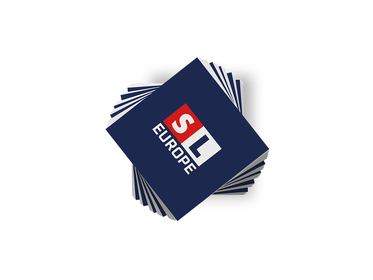
The final composition is an extreme synthesis of geometric figures, represented exclusively by two squares placed side by side.
The chosen structure recalls the world of transportation and logistics while evoking theorganization of goods.
The graphic strength is emphasized by the carefully selected color palette.
A deep blue to emphasize reliability and authority, contrasted with the red of speed, passion and constant commitment.
The typography selected is Oxanium e Agenda One, serif and sans-serif fonts designed for their versatility and visual balance.
Realization of realistic simulations to highlight theadaptability of the logo in different application contexts, such as corporate products, packaging and gadgets.
To conclude, the relevant brand book was produced, which is essential to ensure consistency in each of its applications.
Entrust your projects
to the team at Isola
Discover more
graphic design projects
It is our case histories that speak for us! They show our projects, our approach, and most importantly, our results!
Web marketing and communication services.
Active clients throughout Italy and abroad.
ALWAYS OPEN DURING THE HOLIDAYS!
Design & Copyright by Isola di Comunicazione sas | All Rights reserved 2012-2025 | VAT 12025180964
What's New: Google Premier Partners 2025 Awarded!
We fall within the top 3% of the best performing agencies in Italy 🚀

