Yes: paper still has its purpose, and some promotional tools cannot do without it. The corporate brochure is one of them.
Do you know how to make a brochure that is meant to last? That is, do you know the characteristics it must have in order to be read and retained by the recipient?
Find out in our article how to convey information about products and services in a useful and interesting way.
How to make a brochure: design
The first step in creating a corporate brochure is design. Study what elements you want to include and what message you want to convey, then in the next chapter we will look at how to do it in practice. Your plan of action should consider the following aspects:
- Purpose: Identify the marketing/communication goals you want to pursue through the printing of your corporate brochure. How is it distributed? What segment of your target market is it aimed at? What benefits do you hope to derive from it? Answering these questions, will make it easier to implement in practice and allow you to increase the efficiency of your strategy.
- Logo: it’s your trademark. If you don’t have one, it may be time to create one. N.B. Pay attention to the best resolution for printing. For more, read: Famous advertising logos: 5 instances where the logo made a difference.
- Images: select a few images of your products, or photos that aptly describe your business.
- Text: use the right words, in the right quantity, to convey your message. The copy part includes “About Us,” product/service information, contact details (address, phone numbers, on-call hours, official social accounts, company website, and the like).

Create your own brochure: how to do it in practice
The plan is done; all that remains is to take action. Below you will find in detail all the various parts of which a corporate brochure is composed. Each will need to be analyzed individually and harmonized as a whole.
Format
Choosing the right brochure fold is a critical step, because the arrangement of photos and text depend on the fold. In addition to the double format, with the fold in the middle of the document (for long or wide), there are 3- or 4-page folds with a window, wallet, or accordion fold. Depending on the purpose of use, some folds are more effective than others.
Tip: To visualize the format and layout, take a piece of paper and fold it according to what your preference is, then create windows for text and images so that you have a template in front of your eyes.
Design
The choice of design, that is, the combination of images, text and logo, can be destabilizing because the possibilities are almost endless. In order not to get carried away, all that’s left to do is to follow one simple and basic rule: the whole thing must look understandable.
Tip: Ask our graphic design studio about the best techniques for reconciling usability with the Wow effect!
Photos
To attract the eye there is nothing better than a good photo. But if the photo is blurry, already seen, impersonal you will get the opposite effect and the brochure will be irreparably damaged, defeating all your efforts.
The quality of the images and their selection are therefore decisive, especially when presenting a product. Always evaluate the intervention of a professional photographer: it is essential.
Copy
Concise and incisive text is what you must try to achieve. “Less is more” is the rule, although too little is not equally good. The optimum would be to be able to provide all the information without overwhelming the reader. In principle
- the front cover features your product or service
- the back one shows the contact information
- the inside pages tell a story, your story.
In fact, even in small spaces such as the corporate brochure, you should never give up on presenting yourself in an engaging way: storytelling is not limited to social posts! Finally, it sounds trivial but it is not, always check for spelling and grammar errors. With texts you don’t mess around: contact our copywriters if you need help!
Font
What was said above for design also applies to typefaces: yes to functional creativity, no to style exercises for their own sake. Typefaces should be legible and blend well with the background color. In general, one typeface is used for the body of text and one, called complementary, for titles and headings.
Paper
You’ve thought about layout, copy and images, but it’s not over yet. It remains to choose the type of paper, which should be evaluated mainly in relation to the purpose. Glossy paper, which is thicker, is perceived as adding value and already offers a refined image. Coated paper brings out vibrant colors and large images. Recycled paper says your company cares about the environmental cause. In some cases laminations may be useful to ensure longer life for the brochure.
At this point, after final review, you can proceed with printing and then mail your brochure, or display it in predefined locations to attract new customers, distribute it at trade shows etc.
Ask us for a consultation to create a customized brochure
As much as online tools for creating a brochure have multiplied in recent years, none of them can replace the intervention of a trained and competent professional. Especially when working as a team with others of different specialties.
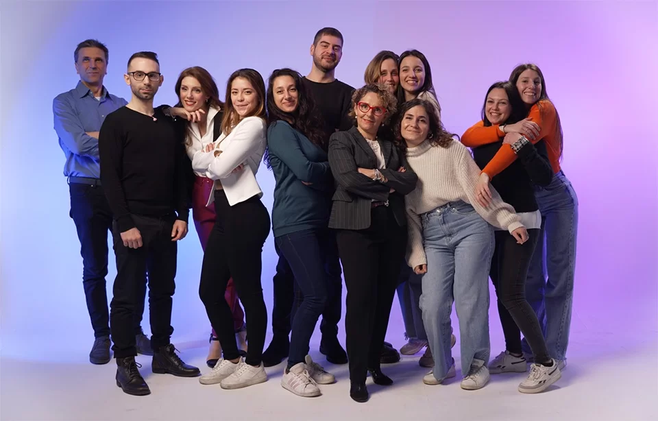
This is exactly what happens with us at Isola Communication, a creative agency in Milan in which you will find graphic designers, web designers, SEO specialists and content writing experts. Different skills put at the service of a single mission: to create a tailored communication strategy, in which the creation of a corporate brochure becomes a performing tool to achieve your goals.
If you would like to learn more about our Web Agency and meet the people who make it so special, take a look at About Us or visit our Portfolio. You can contact us with no obligation, we will still be happy to!