NEXAL BROKER NEXAL BROKER NEXAL BROKER NEXAL BROKER
project:
Goals
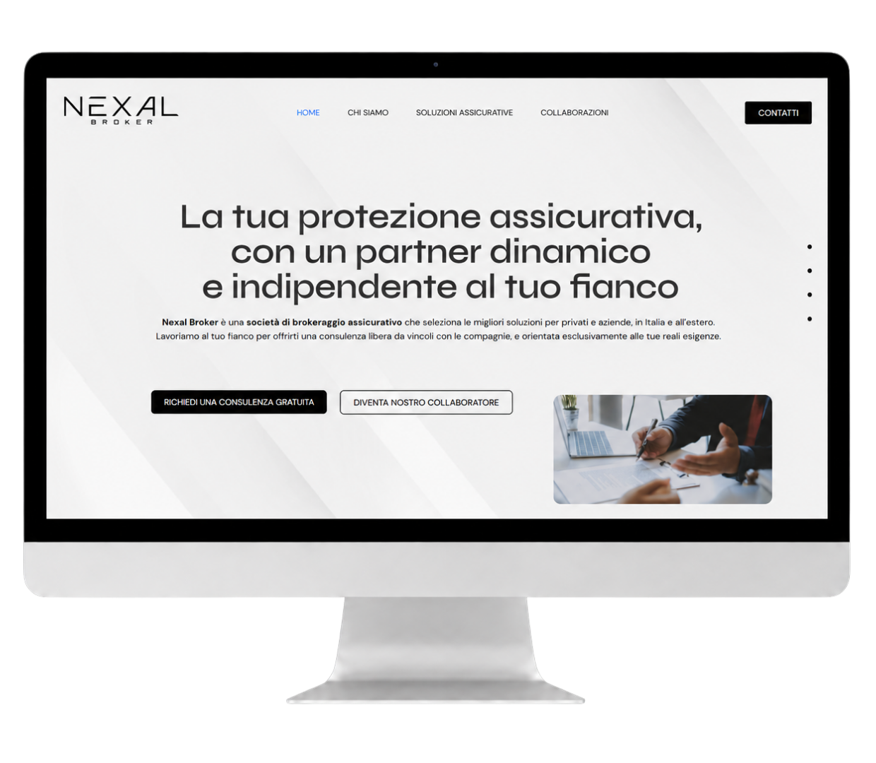
For Nexal Broker, we developed a showcase website designed to build the agency’s digital presence from the ground up and professionally showcase online a new player in the insurance brokerage sector, created to assist individuals and businesses in choosing the solutions best suited to protecting their interests.
Since there was no previous digital history, the main requirements were:
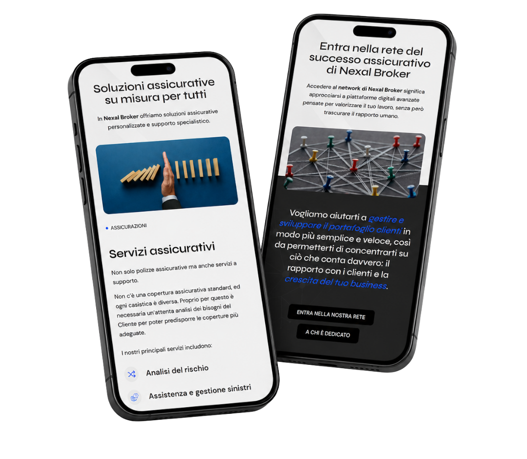
The visual design is based on a high-contrast scheme, featuring a heavy use of black and dark tones. This graphic approach gives the site a contemporary, elegant look that is consistent with the brand’s identity.
In detail:
The result is a simple yet polished website that allows Nexal Broker to present itself online with a solid, modern, and professional image.
Learn more about our service of website creation!

Site Pluses
We’ve translatedthe brand’s identity online through a clean, dark, high-contrast design. This visual choice is designed to convey professionalism and attention to detail from the very first visit to the site.
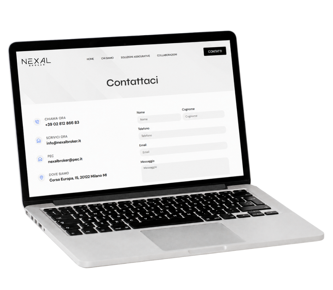
The website was designed to make the user journey clear and straightforward. CTAs and contact forms are integrated at key points in the navigation to make it easy to request information.
We have strategically organized the text, features, and information to avoid information overload and complex navigation paths. Icons, short sections, and bulleted lists help users quickly understand what the agency has to offer.
The website was designed to ensure a smooth browsing experience even on smartphones, while maintaining readability, visual clarity, and ease of use on every device.
Entrust your projects
to the team at Isola
Here are other websites made

What's New: Google Premier Partners 2025 Awarded!
We fall within the top 3% of the best performing agencies in Italy 🚀